Beona

Master Logo

Beona’s logo extends off the “O” in their company name, hinting at upcoming expansion. We designed it as a master logo, with the flexibility to incorporate future divisions of the company.

Logo Design

Master Corporate Logo

Beona wanted something fresh and modern for their logo. We created an icon in the logo wordmark (to signify “management”) and a connection between the master company and its divisions.

Many other organizations in Beona’s industry use sterile, blue logos and traditionalist serif fonts. To differentiate Beona, we chose a modern green and sans serif typeface to convey forward thinking. Using all caps in the logo signalled professionalism as well as dominance for this master logo.
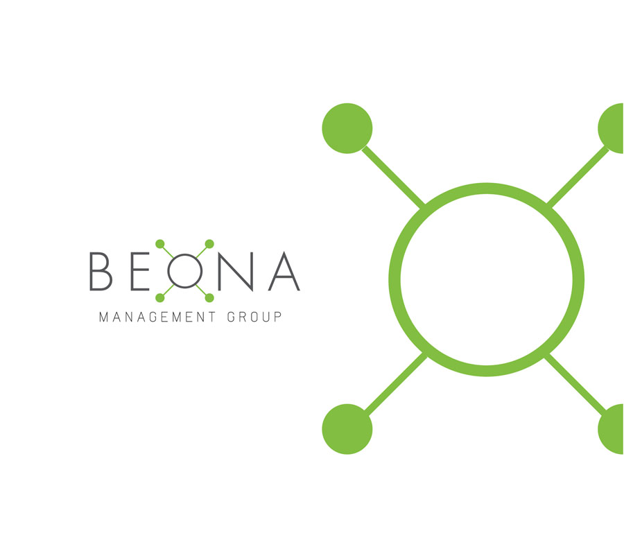
Beona Master Corporate Logo

More projects for Beona

Dansereau Meadows Community Website Antares Identity Package Antares Logo Design Tuscany Hills Community Website Trumpeter Community Website Allard Community Website Direct Mail Postcard Advertising E-commerce Website & Online Advertising Digital Presentation TinHouse Designs & Coffee Co. Logos Store Front Advertising Direct Mail & Postcard Advertising Company Product Website Business Cards Company Logo Design