PinPoint Marketing and Advertising Edmonton


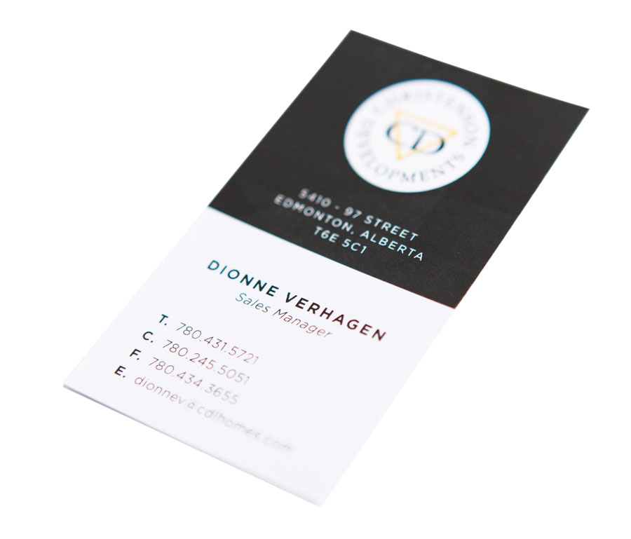
We designed the Christenson business cards with a simple, clean design to reflect their brand identity and professional image. We used the primary brand colour, black, to highlight the triangle in the logo, which provides the only piece of colour on the business card.
The business card is designed as a vertical format to subtly reference the idea of building homes (a key part of Christenson’s business).
We designed a one-page insert for all Christenson Communities sales packages that outlines the services provided for their assisted living program in retirement communities. We kept the design simple, with a circular, yellow graphic highlighting the top and bottom of the page and a small Christenson Communities logo.

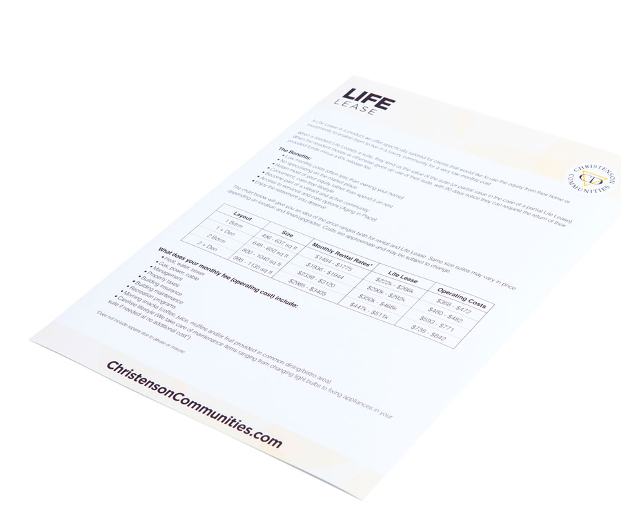
Maintaining consistency with the design of the assisted living insert, we created a one-page insert for Christenson Communities that discussed their life lease product. The clean, simple design again uses the yellow brand colour and the Christenson Communities logo for easy integration into their sales packages.
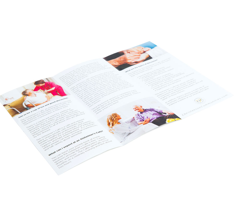
Another piece for the Christenson Communities sales package was their Alzheimer’s Cafe brochure. Designed with a tri-fold format, this piece informs clients about how the program works while maintaining the same look and feel as the one-page inserts. The brochure cover matches the inserts, while the inside pages feature brand-consistent imagery.
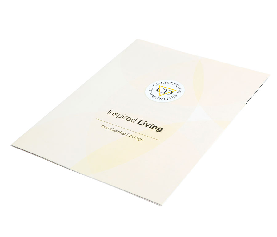
This piece of sales material outlines all the details of Christenson Communities’ retirement community membership package, including scheduled events, bus bookings, brunch services, programs, wellness sessions, fees and vouchers. We created this eight-page brochure using the same yellow, circular graphic as other marketing materials and kept a consistent look for the headers and footers and front and back covers.
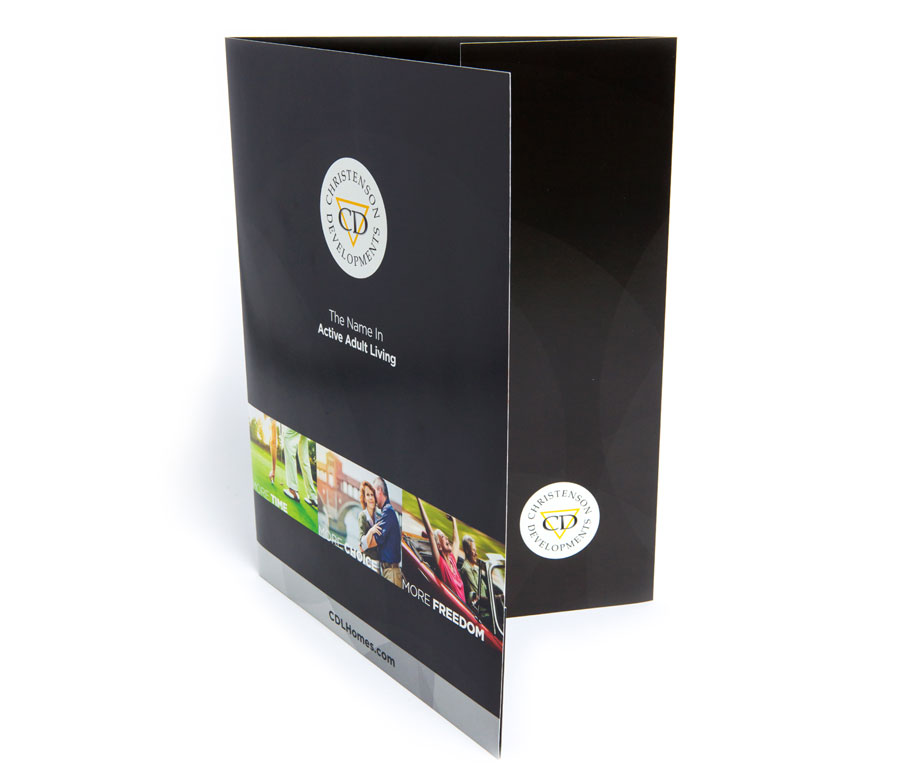
We created Christenson’s presentation folder to coincide with their new branding ad campaign “More Time, More Choice, More Freedom”. This presentation folder is the foundation of all Christenson Developments sales packages. We used the black brand colour to differentiate it from the Communities brand, but kept the design consistent with the Communities branding by using the circular graphic.
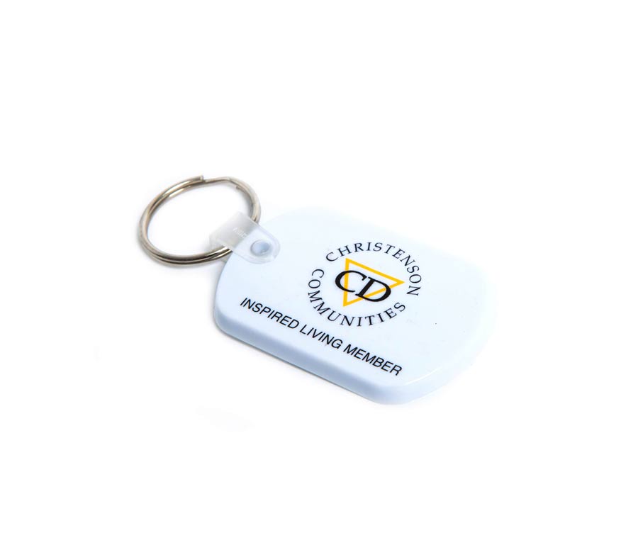
New renters or owners who subscribe to the Christenson Communities’ inspired living package receive a keychain. We kept the design simple by featuring the division’s logo and program name on this promotional item.