PinPoint Marketing and Advertising Edmonton


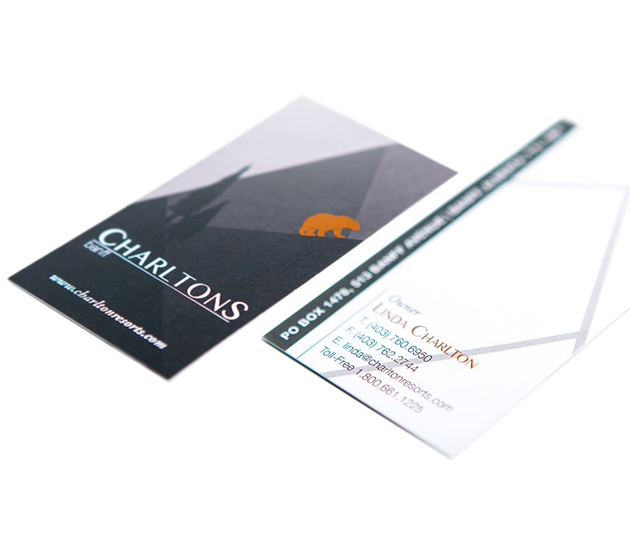
The new identity package for Charltons Banff started with their new business card. To differentiate them, we stayed away from typical hotel pictures and used a more graphic style. The illustrated mountain ranges in a geometric design give a modern, sophisticated look and feel. The tree silhouettes with the bear and mountain graphics add visual interest.
The front of the business card features the bear on the mountain, giving a pop of colour. The back of the card has an outlined version of the graphic, similar to the lines you would see on a city map. The lines also call to mind the mountain graphic without duplicating it.
The vertical format of these cards seemed fitting for a hotel in the mountains. It allowed us to add height to the card and show off the mountain ranges in the design.
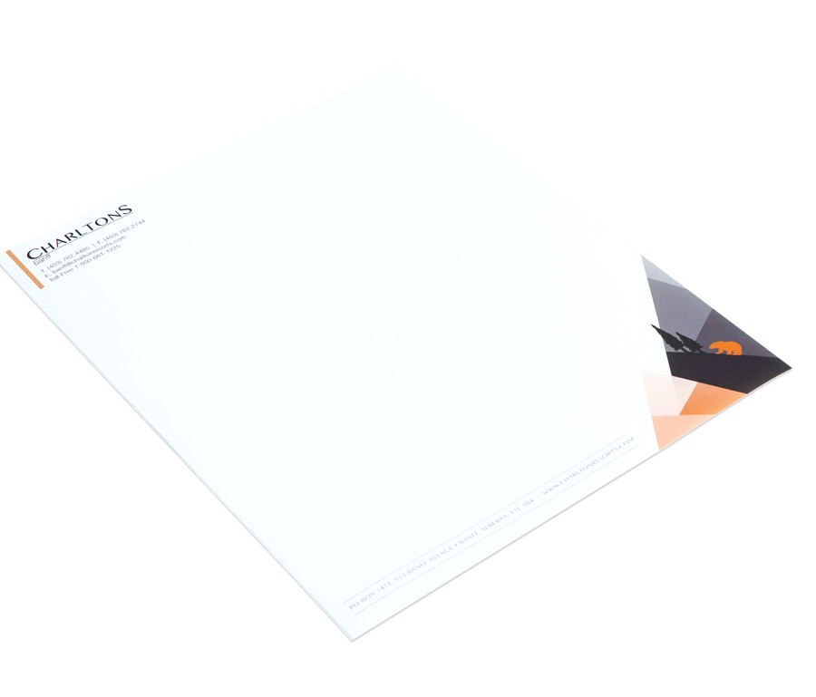
The new Charltons Banff letterhead featured the same design as the business card, with the mountains and bear graphic in the lower right corner and the contact information in the top left.
The bear was the original logo from the hotel’s previous incarnation as the Charltons Cedar Court. Including the bear in the new identity was important because it created continuity for the brand through its redesign while still allowing for a new, fresh logo.