Soak

Company Logo

Soak’s logo does double duty. It reinforces their company name while literally reflecting their products, effectively triggering brand recognition with their customers.

Logo Design

Company Logo

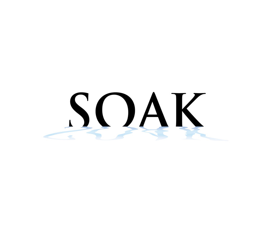
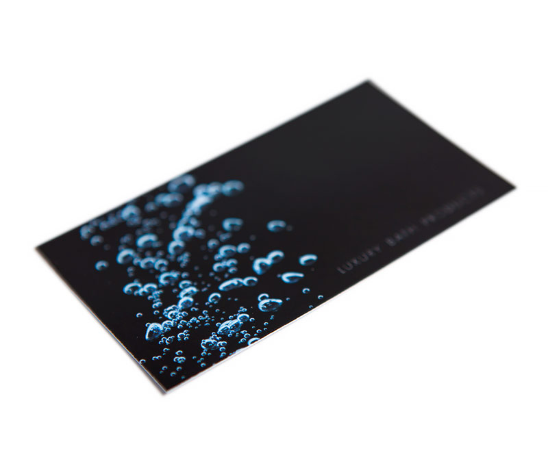
As the name signifies, the company name is soaking in water. We used black as the main colour in the typeface for a strong, bold appearance. The light blue reflection represents water and keeps the main company name in constant motion.

Soak Company Logo

More projects for Soak

Relax It’s On Sale Store Signage & Outdoor Media Publication & Direct Mail Advertising Company Website Brand Elements