PinPoint Marketing and Advertising Edmonton


A brand isn’t a colour or a font, it’s how your customers describe you when you’re not in the room. Since branding shapes your customers’ opinions and therefore your reputation, it must be consistent, persuasive and memorable. (And hey -- a little humour never hurts, either!)
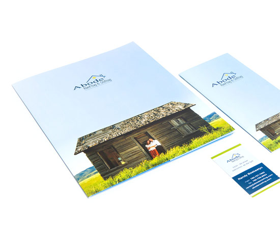
Since consistency is key to brand retention, when PinPoint Marketing put together the identity package for Abode Roofing & Siding, we made sure their vivid new look and feel was woven throughout all their collateral pieces.
Need to get the word out? Meet your new best friend, advertising. Advertising helps you promote your products or services to your target audiences by using attractive calls to action (such as discounts or other promotions) and getting your company repeated impressions (reinforcing your brand messaging).
Outdoor marketing works best when it contains one simple, easy to read message. Large-format ads (such as billboards, vehicle wraps and signs) give great value because they are relatively low-cost and offer a lot of exposure.
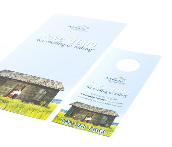
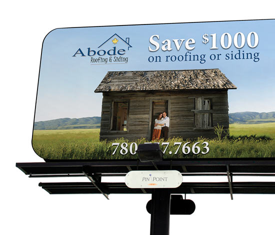
Abode’s large-format advertising used consistent imagery from their identity package to reinforce their calls to action. We also helped them shout it from the rooftops in neighbourhoods where their products were installed with vehicle wraps and signs, two large-format options that are versatile and eye-catching.
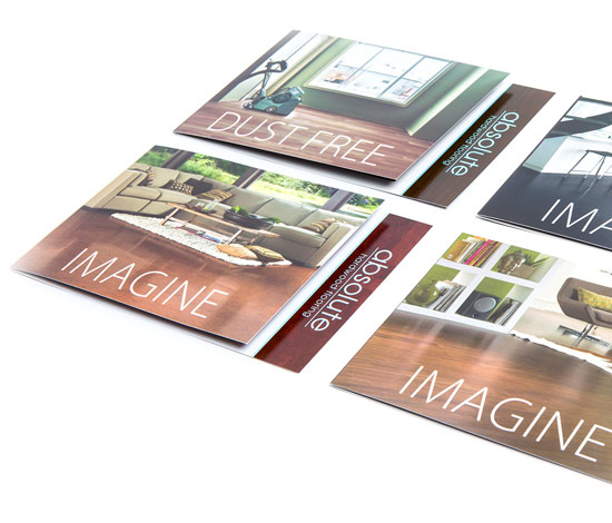
Advertising comes in many formats, and product handouts are an effective way of providing customers with a quick overview of what your company offers. Maintaining a consistent look and feel is key to brand retention and encouraging sales, which is why we used a distinctive, cohesive design for Absolute Hardwood’s product handouts.
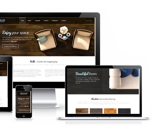
Absolute Hardwood needed a website they could use as a product showcase that displayed hundreds of products in a user-friendly design. We created a dynamic, responsive website that matched beautifully with their existing brand.
Large format advertising, such as outdoor ads, give great value because they are relatively low-cost and offer a lot of exposure. The large images help expand the visibility of a brand by grabbing consumers’ attention, while the simple messaging is easy to understand and retain.
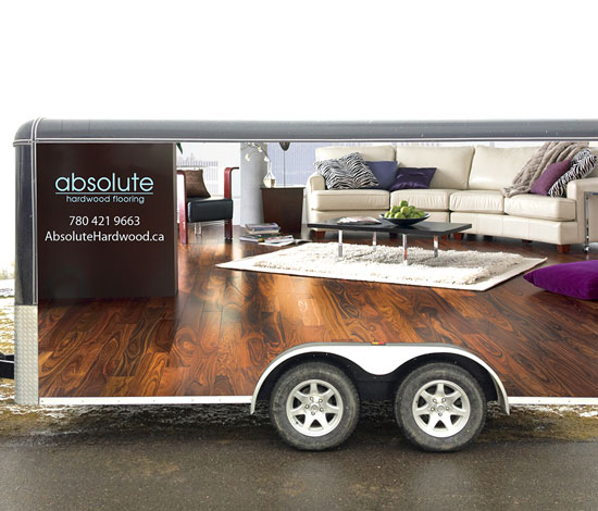
Our large format pieces for Absolute Hardwood took advantage of free space on their vehicles and store exteriors to reinforce their brand.
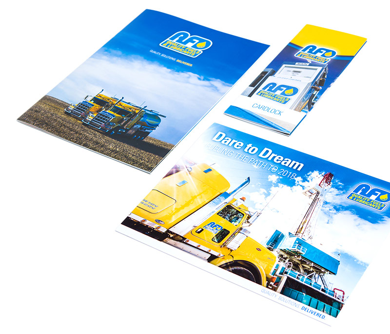
Providing a consistent brand experience is the key to successfully retaining customers. Memorable imagery, brand voice and colours all work together to reinforce your company’s reputation. PinPoint Marketing arranged a photoshoot for AFD Petroleum to ensure that their brand imagery was high-quality and reflected their dependable brand promise.
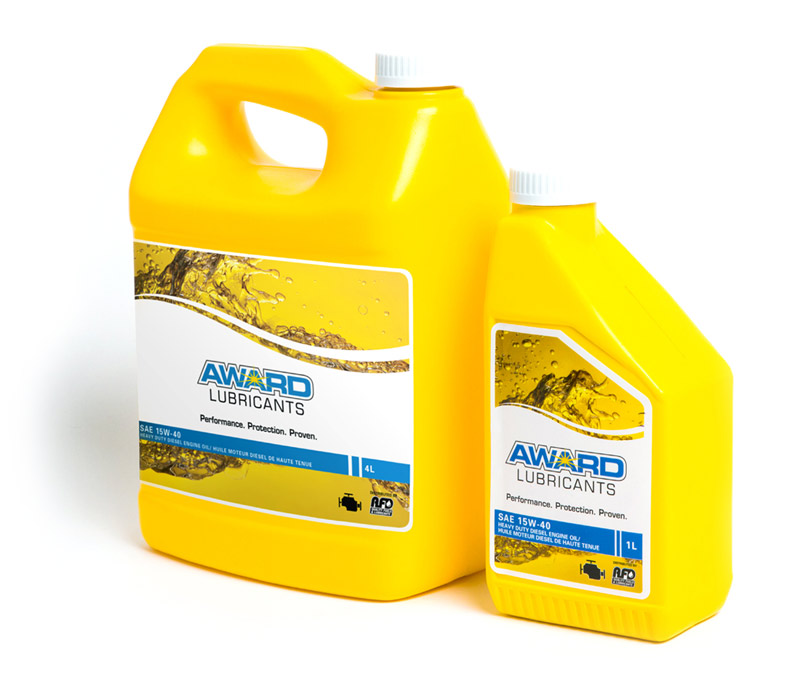
We made sure AFD’s look and feel extended to other divisions of the company, such as Award Lubricants, so that customers could intuitively recognize the brand.
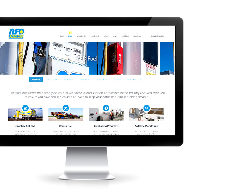
AFD’s redesigned website consistently reinforced their company brand and enhanced their brand promise by offering an educational and informative content. This showcase of their thought leadership served to market AFD’s services while providing an intermediary customer touch point. Customers can make informed decisions and also have access to multiple calls to action on AFD’s website. Our reorganization of their website led to a 30% increase in site visitors over the previous year, as customers found the website content more accessible.
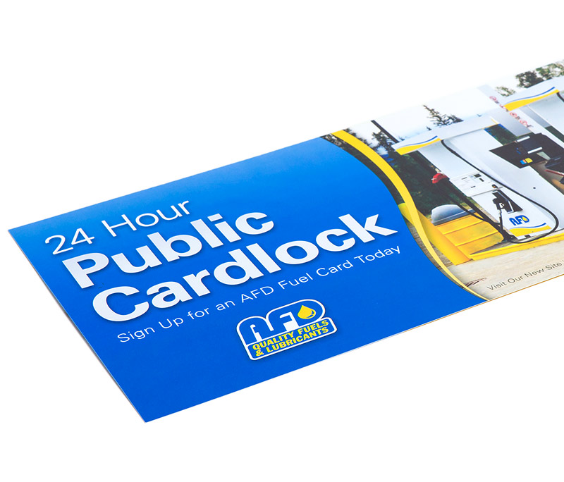
AFD wanted to get up close and personal with their customers, so PinPoint Marketing arranged a direct mail campaign to help reach out. We designed the direct mail pieces as extensions of ad campaigns for specific AFD divisions (Fury Fuel and Gravity Cup) to promote AFD’s involvement in racing events.
Large format pieces are an attractive advertising medium because they give great value. For their relatively low cost, they offer your company maximum exposure to customers.
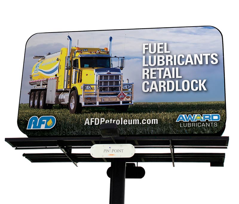
To complement AFD’s other communications to their customers, we ensured their large format materials, which included a billboard and tradeshow booth, were simple, direct and easily understood, using no more than a few words to convey their messaging.
Consistency is key with large-format advertising, so we designed AFD’s using the same imagery as other marketing pieces to reinforce their brand.
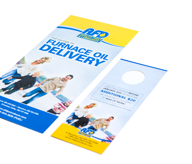
AFD needed to reach a specific target market (families) to increase awareness and sales of their oil and home heating services and delivery programs. We helped them reach out by designing a direct mail and publication advertising campaign that strategically focused their message. Using savings and discounts as the main call to action of the campaign, we used consistent brand colours with imagery of families to pinpoint targets in British Columbia.
When AFD came out with a new product line, we created an identity for it that was consistent with AFD’s overall brand identity. Using these consistent elements, we focused on large-format billboard advertising as a cost-effective medium to reach a broader audience and promote the new Award Lubricants product.
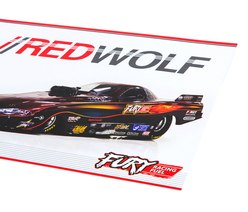
AFD’s racing fuel division, Fury Fuel, is the fuel supplier of select racing events. PinPoint Marketing designed a promotion campaign to help AFD reach out to potential customers. T-shirts, event handouts, a billboard and advertisements in select publications helped Fury Fuel grab attention both on the track and off.
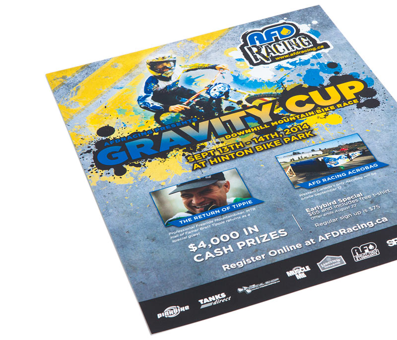
AFD’s racing division is devoted to supporting communities and investing in sports teams, athletes, events and non-profit groups. One of the main events AFD Racing sponsors is the Gravity Cup, a downhill mountain bike race.
To attract audiences to the event and raise awareness of AFD’s sponsorship, we designed posters and web advertising to catch readers’ eyes while reinforcing AFD’s brand identity. We produced two different but consistent t-shirt designs -- one for volunteers, and one for attendees to purchase. All these campaign pieces had a consistent look and style that communicated AFD’s brand while reflecting the fun, casual event atmosphere.
Alberta Home Builders needed an identity that reinforced their collective commitment to building sustainable retirement communities. To ensure their logo represented the group’s core values, our logo design gave viewers the impression of an established Alberta organization, calling to mind public service and expertise.
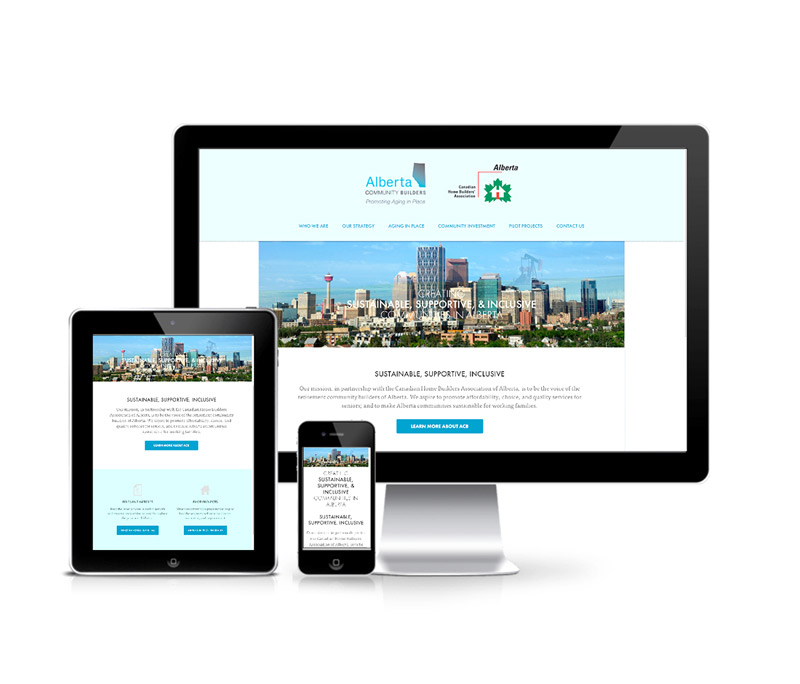
We created Alberta Community Builders’ website as an extension of their branding, with educational and informative content that showcased the company’s services and the homebuilders involved in the organization.
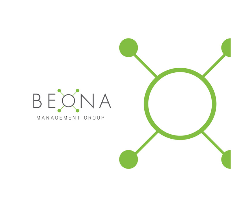
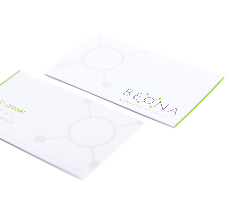
We designed Beona Management Group’s logo as a master logo with the flexibility to incorporate future divisions of the company (such as investment or property sections). The logo has a professional, clean and modern look.
Beona’s brand identity is consistent with their logo, using clean lines and lime green and grey colour scheme. We designed it to be simple, using only the icon from the logo as the design treatment, to keep with Beona’s minimalist, fresh esthetic.
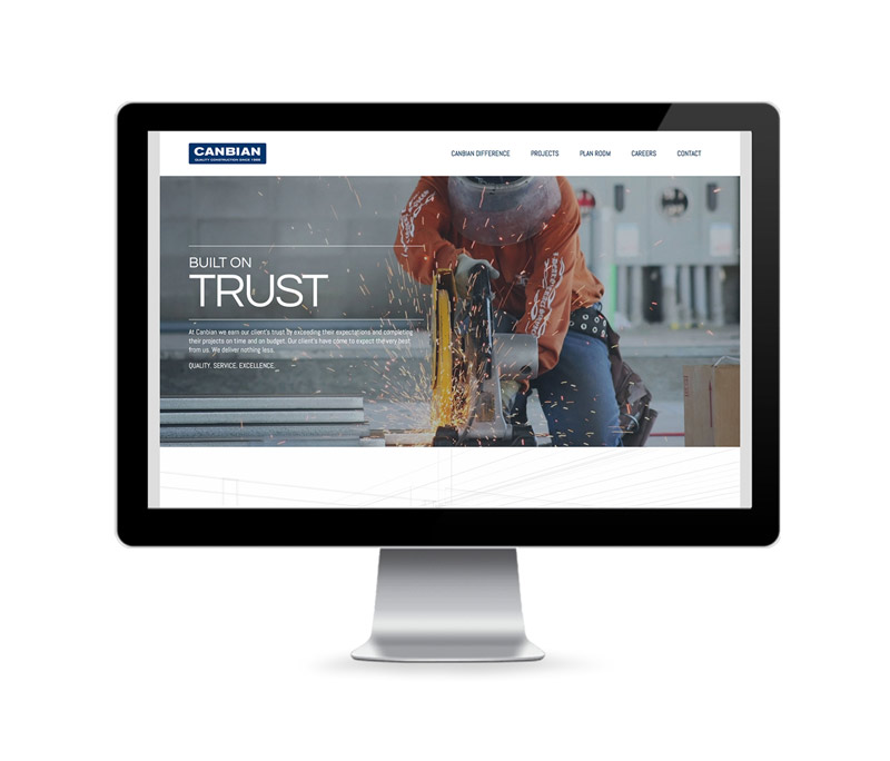
We were tasked with modernizing Canbian Construction’s logo so that it was consistent with modern logo standards and could be used in a variety of formats. We simplified and refreshed it, ensuring that the company can use it for years to come.
A brand is more than a colour or font...it’s how your customers describe you. Since branding shapes your customers’ opinions and therefore your reputation, it must be consistent, persuasive and memorable.
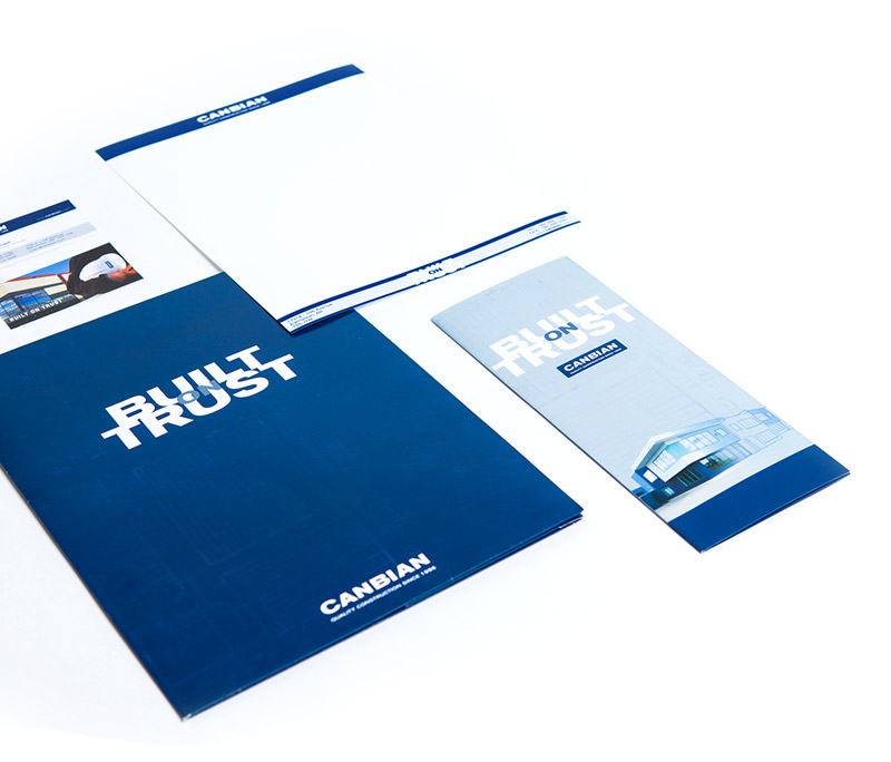
Since consistency is key to brand retention, when PinPoint Marketing put together the identity package for Canbian Construction, we made sure their vivid new look and feel was woven throughout all their collateral pieces, which included a branded sales package that Canbian staff could use as a sales tool.
It was important to Canbian that we include their motto in many identity pieces because this statement is central to their brand promise. Canbian earns clients’ trust by exceeding expectations with timely, on-budget completion of projects, and we reinforced this throughout the marketing materials we designed.
A website is an extension of a company’s brand and should contain consistent, persuasive imagery to encourage brand recognition. We refreshed Canbian’s website and redesigned it as a responsive, user-friendly site that helped customers make informed decisions. This educational approach reinforced Canbian’s expertise while marketing the company’s services.
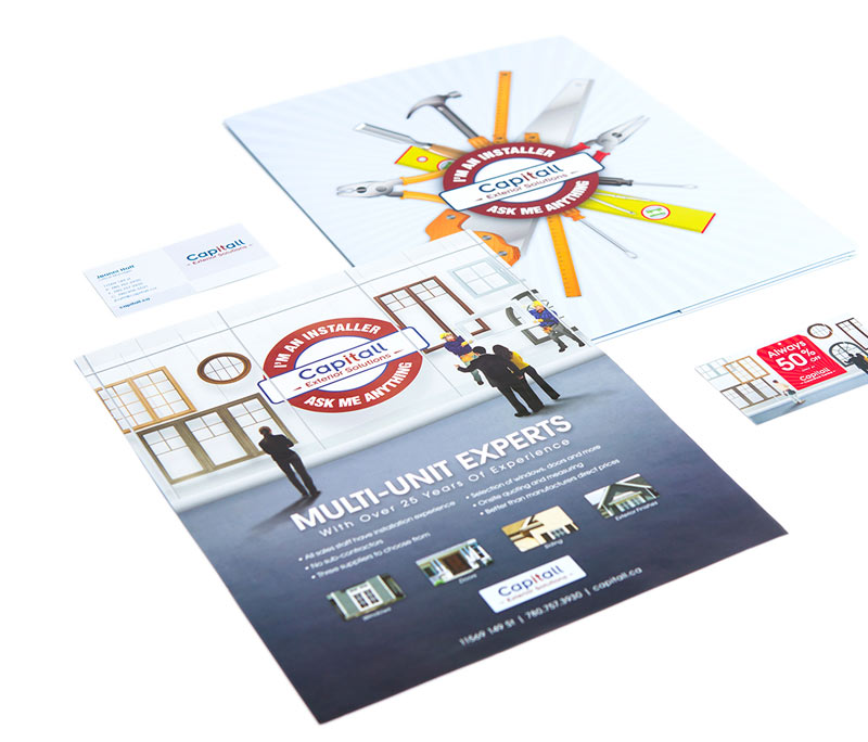
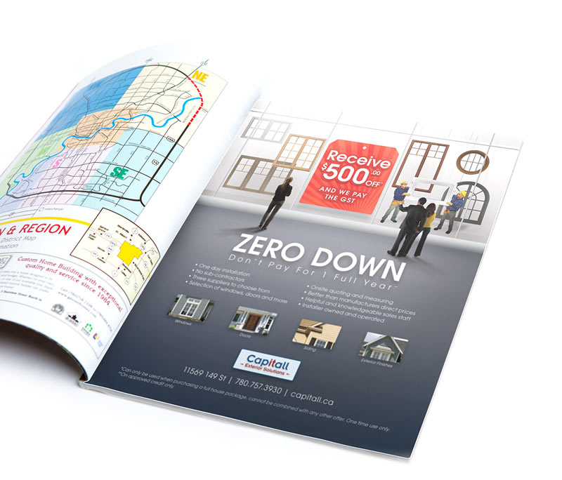
Since consistency is critical for effective branding, we ensured that the new identity package we created for Capitall Exterior Solutions had recognizable imagery, colour and messaging.
Often times, identity packages are extensions of marketing campaigns. With Capitall, we featured the concept of window shopping for windows, a clever play on words and images, as the foundation of the brand identity and subsequent campaigns. This bold look and feel focused primarily on Capitall’s new installation division.
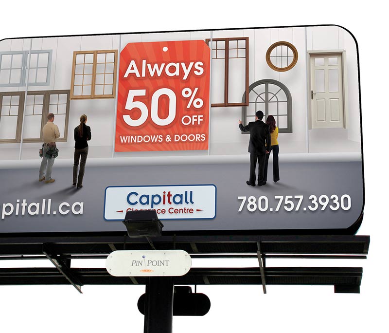
Large-format advertising (such as outdoor ads and in-store marketing pieces) remind customers about messages that you’re promoting through other media, and it works best when it contains one simple, easily-read message. These large ads give great value because they are relatively low-cost and offer a lot of exposure.
Capitall’s ads had consistent imagery to reinforce the campaign advertising and focused on the clearance centre division
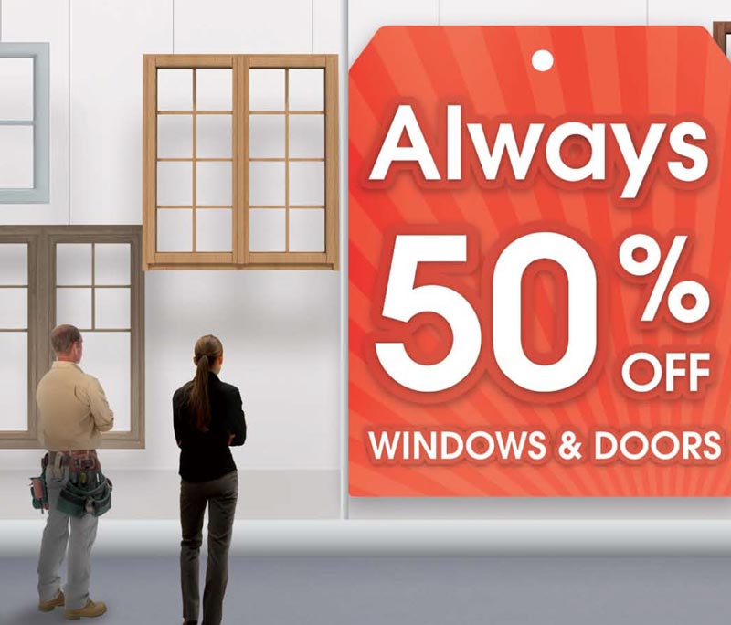
For Capitall’s “Always 50% off” campaign, we stayed true to their brand identity by featuring the window shopping for windows imagery. We applied a red tag concept in this campaign to complement the brand identity while signalling to customers that the campaign was focused specifically on a discount they would receive from the clearance centre. We distributed this campaign through a variety of marketing channels, including billboards, window perfs, store banners, direct mailers and publication ads.
We used direct mail advertising to reach prospective Capitall customers on a more personal level. Using the same window shopping and red tag concepts, we leveraged the look and feel of publication ads to create a consistent brand experience while promoting both divisions of the company.
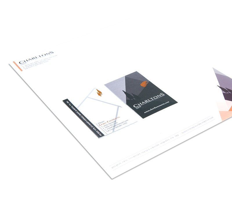
Charltons Banff redesigned their logo and brand image and needed a new identity package to go with it. We provided them with a fresh look and feel that had an elevated sense of design, giving the company a modern and sophisticated feel while remaining true to their gold/bronze and grey/black colour scheme.
Logos can change over time, but brand equity remains, even through updates and improvements. It’s crucial for well-established companies to update logos and other brand elements to stay relevant to their industries -- and new generations of customers.
Christenson’s logo has evolved, becoming simpler and reflecting different divisions of the company, but its impact remains.
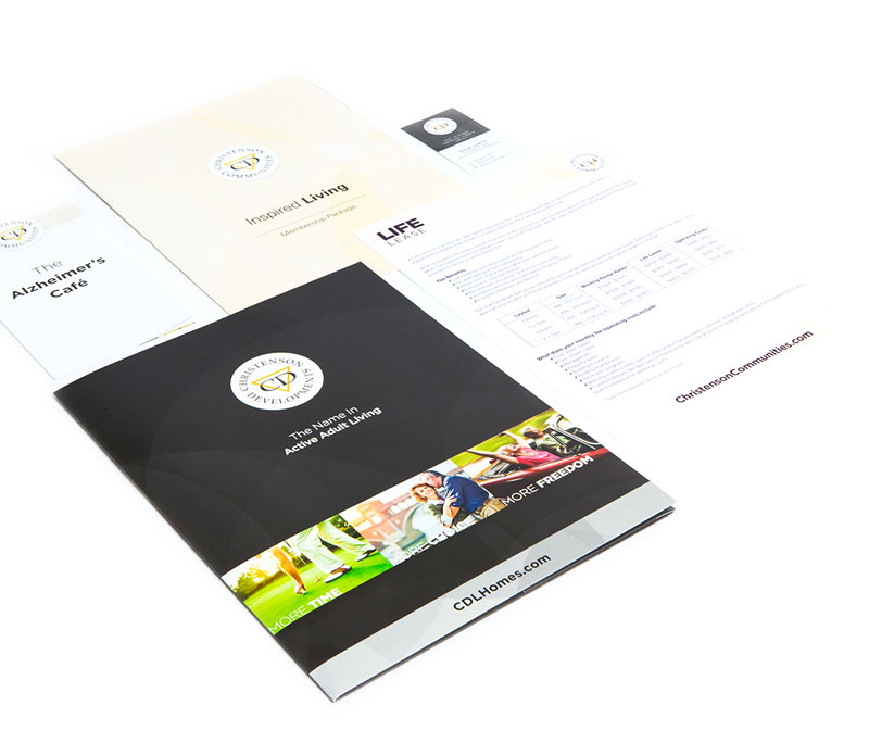
A brand isn’t a colour or a font, it’s how your customers describe you and how you can shape their opinions. Your brand identity must be consistent, persuasive and memorable, since it shapes your reputation.
Since consistency is key to brand retention, when PinPoint Marketing put together Christenson’s identity package, we made sure their primary look and feel was woven throughout all their collateral pieces. We used branding to differentiate the Christenson parent company from its divisions while using consistent fonts, colours and imagery style.
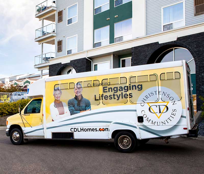
Outdoor marketing reminds consumers about messages that you’re promoting through other media, and it works best when it contains one simple, easily-read message. Large-format ads (such as billboards, vehicle wraps and presentation booths) give great value because they are relatively low-cost and offer a lot of exposure.
Christenson’s large-format advertising informed customers about new communities and reinforced brand recognition through consistent imagery and messaging.
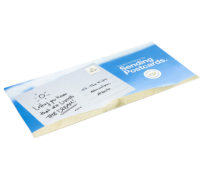
We helped Christenson promote home sales by creating their “enter to win” campaign. Customers who purchased select homes or condos in Christenson developments could enter to win a trip for two.
We used a fun postcard theme for this incentive-based marketing campaign to spark customers’ imaginations -- they could picture themselves on a vacation made possible by purchasing a home with Christenson.
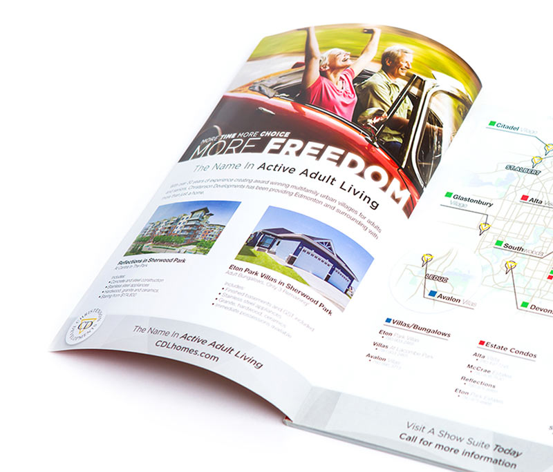
We created the “More” campaign to rebrand Christenson and show customers the lifestyle they could obtain with more time, more choice and more freedom. The campaign depicts three different lifestyles (adult, retirement and rental) and shifts the focus away from the property and onto the persuasive “what’s in it for me”? elements, like more time to travel, more living choices, more financial freedom to buy that new car.
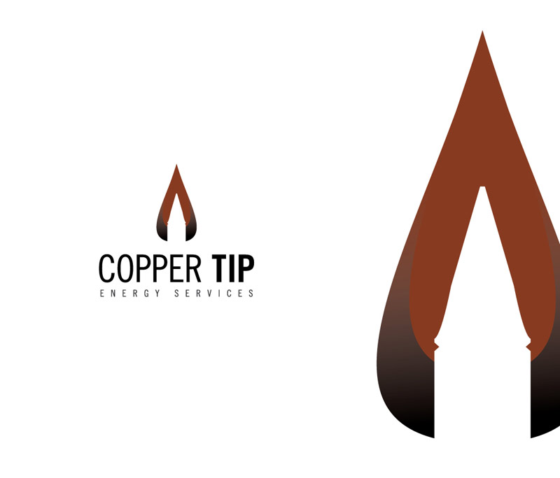
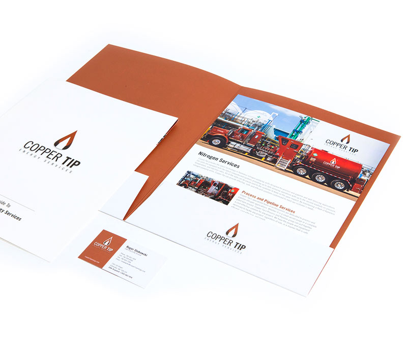
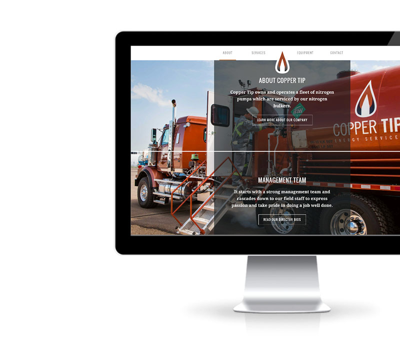
We emphasized Copper Tip’s strength and history in our logo design. The colour reflects both the company’s name and industry, while the icon has a bold, modern look crafted for longevity.
We ensured Copper Tip’s brand identity had consistent messaging and creative style. Their metallic copper colour is featured throughout all collateral, and the clean, simple typography emphasizes the content and products.
We ensured Copper Tip’s brand identity had consistent messaging and creative style. Their metallic copper colour is featured throughout all collateral, and the clean, simple typography emphasizes the content and products.
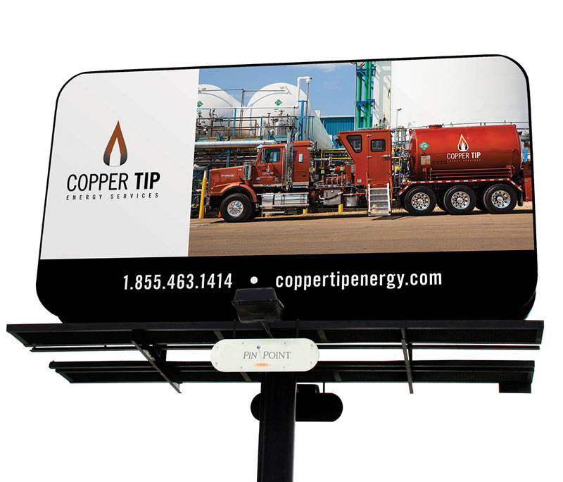
We suggested large-format advertising for Copper Tip because it offers maximum exposure for a relatively low price. To increase brand awareness, we created consistent outdoor billboards and a trade show booth to help Copper Tip reach new audiences.
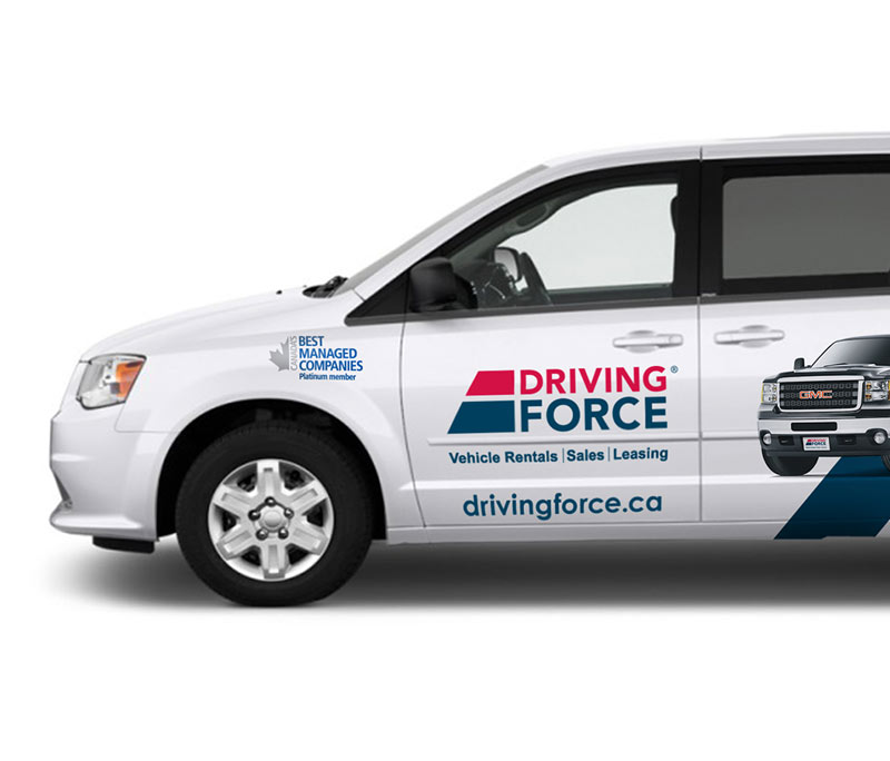
Large-format advertising, such as vehicle wraps and outdoor signage, reminds consumers about messages that you’re promoting through other media. Relatively low cost, large-format pieces offer maximum exposure, making them an attractive complement to advertising campaigns.
Since large-format pieces should be simple, direct and easily-understood, we used simple messaging with eye-catching imagery to promote Driving Force’s products.
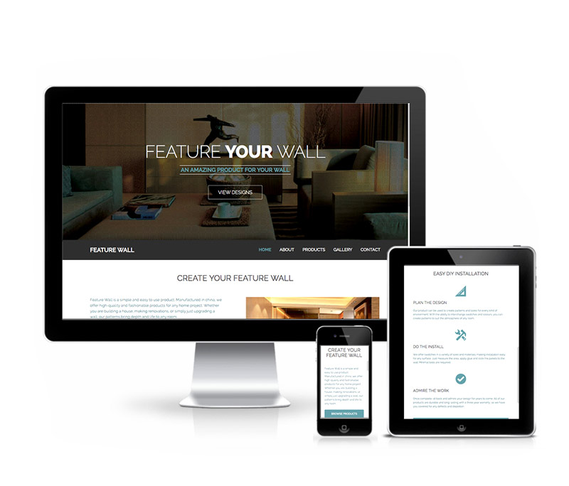
Feature Wall, a do-it-yourself product, produces high-end and fashionable products that customers can use to cover up any wall or upgrade any flat service. We designed Feature Wall’s website to reinforce their company brand and act as a sales tool to market the product and its varied uses.
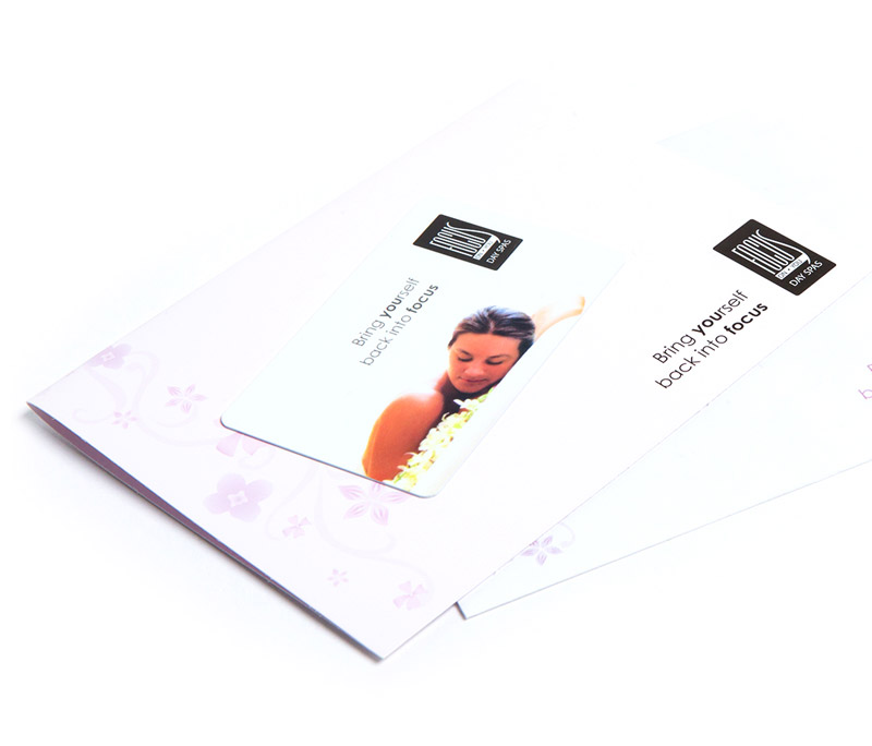
A brand isn’t a colour or a font, it’s how your customers describe you to others. Since branding shapes your customers’ opinions and therefore your reputation, it must be consistent and memorable across a variety of mediums (even non-traditional ones like gift cards and service listings, two important collateral pieces used in the service industry).
We used consistent messaging, images and colours to create an effective brand for Focus on You, which was key to differentiate them from other companies.
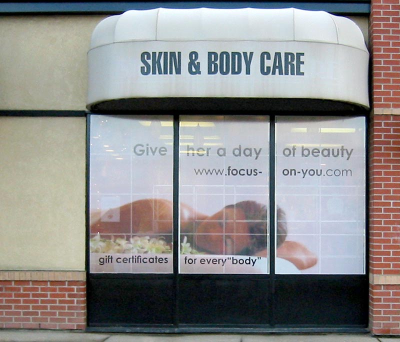
Store fronts are an excellent opportunity to promote brand awareness, and a key ingredient of success for spas, a business where it’s important to sell a feeling or lifestyle, not just the service.
We took advantage of Focus on You’s large windows to create a window perf with persuasive, branded imagery and lifestyle-focused messaging.
While logos can change over time, their established brand equity remains. It’s key for well-established companies to update logos and other brand identifiers to stay relevant to new generations of customers.
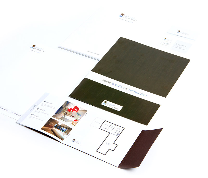
Homes by Element’s logo has evolved over time, updating to reflect their primary service offering, custom homes.
A brand isn’t a font or specific colour, it’s how your customers remember you, and how you shape their opinions. Consistency is key to brand retention, repeating messaging and imagery shapes your reputation and keeps customers coming back.
To give Element’s customers a consistent experience, we designed their brand identity to echo the simplicity and modern style of their homes, with this look and feel woven throughout all their marketing pieces.
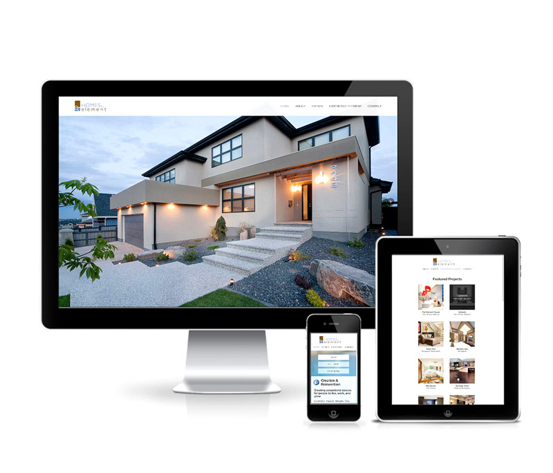
We created Element’s website to serve as an online portfolio of their different projects as well as design inspiration for their audience. The website has responsive design, offering large visuals with a clean, modern, branded design consistent with other marketing pieces. This focus on details allowed Element to use their website as an intermediary touch point for customers so that they could make informed product decisions.
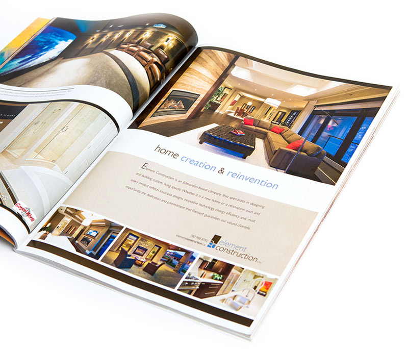
We placed ads in publications to reach a segmented audience of potential customers who were already interested in home projects. Using a similar look and feel to the Element website, we let the high-quality details in the bold imagery showcase the attractive products and services that Element offered.
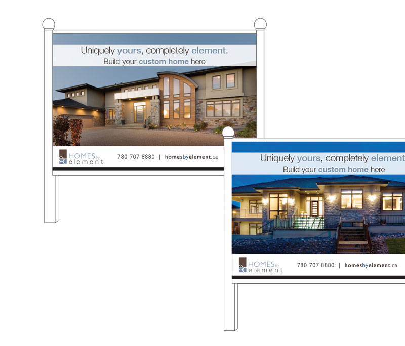
Large-format advertising, such as location signage, reminds consumers about messages that you’re promoting through other media. It’s an attractive option because it’s relatively low cost and offers maximum exposure. Since large-format pieces should be simple, direct and easily-understood, we used simple messaging with eye-catching imagery to promote Element’s services and future developments and projects.
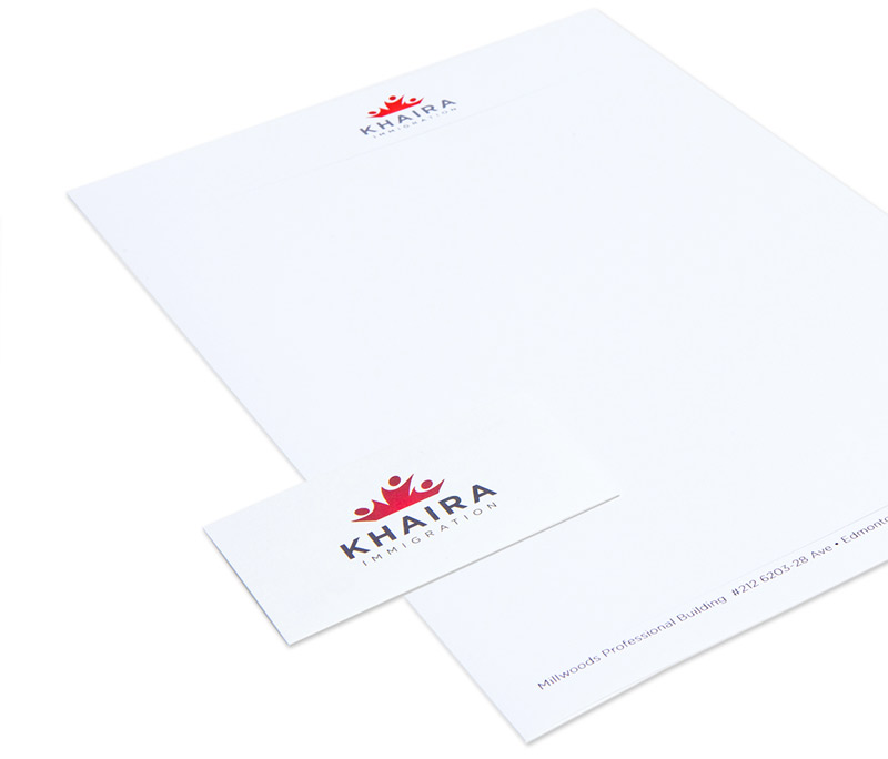
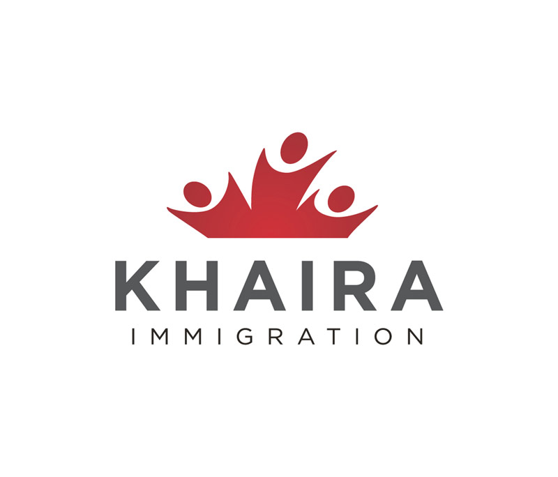
Although Khaira’s brand identity elements were friendly, we ensured the design style was also timeless so that the brand would serve Khaira for decades to come. The minimal, clean style carried throughout, making all marketing pieces easy to read and understand.
To reflect Khaira Immigration’s business in their brand, we created an instantly-recognizable logo based on the Canadian flag. The patriotic colours reinforced Khaira’s services, while the circles created the illusion of waving people, giving audiences a friendly impression.
Kingsway Toyota needed a logo that fit within Toyota’s brand while making the dealership stand out from the crowd. We ensured the look and feel of their new logo was consistent with the master brand but still communicated the dealership’s individuality.
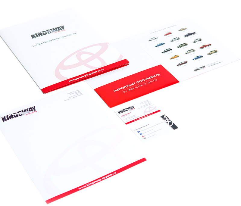
To ensure Kingsway Toyota presented a professional, consistent impression to clients, we designed a complete identity package for them that included a business card, letterhead, two presentation folders (a mini and full-size). All these materials leveraged the Toyota master brand.
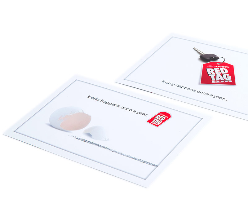
To help Kingsway Toyota promote brand awareness, we designed postcards with a call to action and discount offer. These versatile pieces were used as both direct mail advertising and as handouts for customers at the dealership.
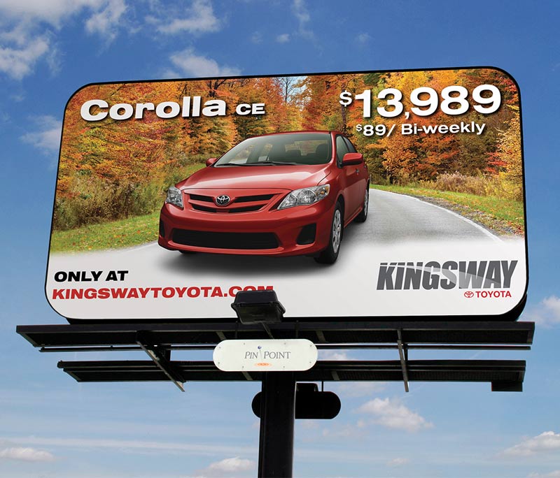
To give Kingsway Toyota maximum exposure for a relatively low cost, we created bold large-format outdoor advertising. The large scale matched the size of the products to easily show off the vehicles’ details while catching the audience’s attention.
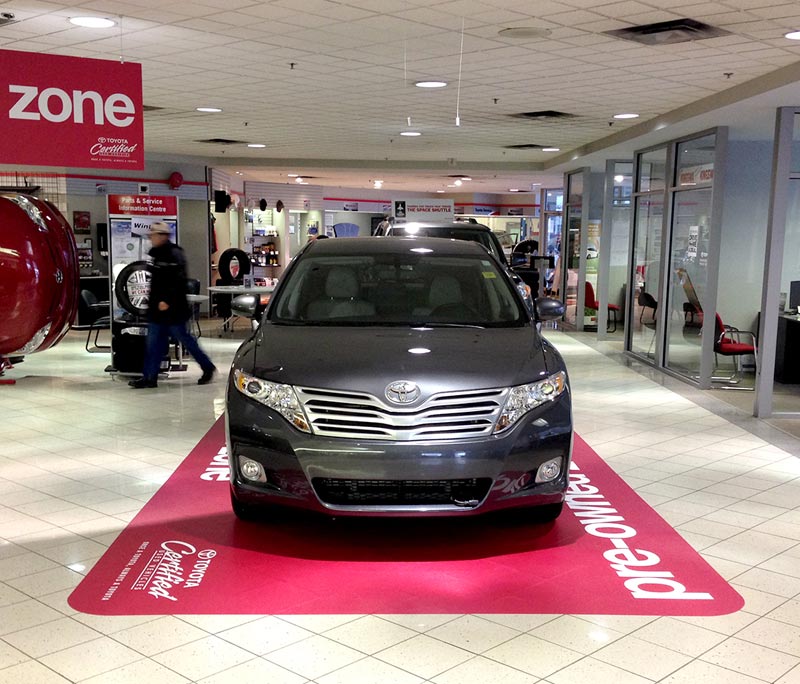
Kingsway Toyota’s sales center needed a friendly atmosphere and easy flow of traffic despite the limited amount of space. We designed targeted “zones” inside the dealership to showcase pre-owned and hybrid vehicles while visually dividing the space so that customers wouldn’t feel claustrophobic.
Our large-scale interior signage matched the size of the products to produce a wow factor and direct customers’ attention.
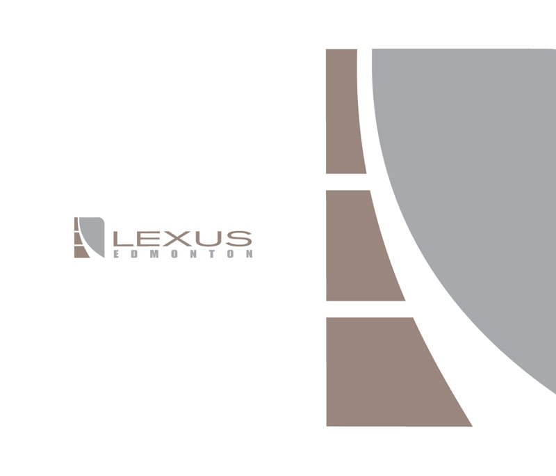
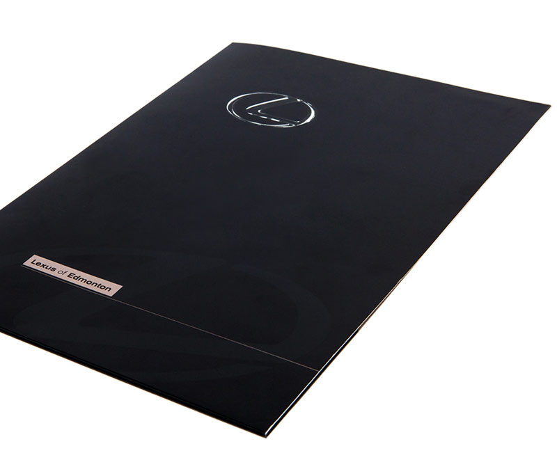
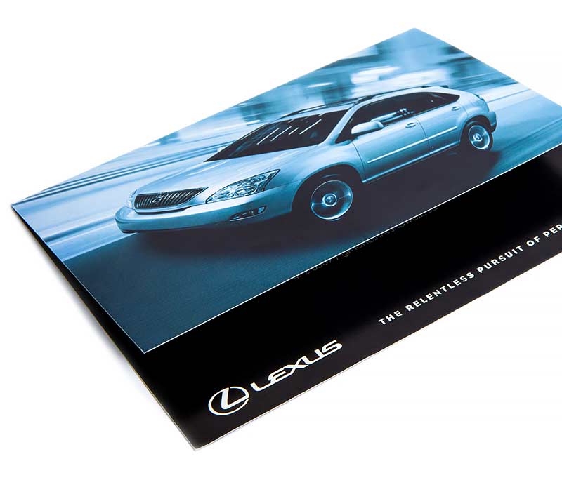
We designed Lexus of Edmonton’s logo to fit within the master Lexus brand while giving the dealership a complementary identity of its own. The look was sleek and modern to reflect the products that Lexus of Edmonton stocked.
The new Lexus of Edmonton presentation folder was created to make it easy for staff to pull together customer sales and information packages while communicating their brand.
We launched a branded direct mail and publication ad campaign for Lexus of Edmonton to promote awareness of the dealership and their current sales. This campaign reached customers on a more personal level by targeting advertising to specific addresses and previous dealership customers.
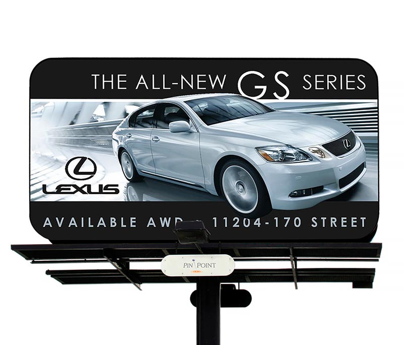
Billboards are an attractive advertising medium because they offer maximum exposure to audiences for relatively low cost. They’re also excellent for promoting larger products (such as vehicles) because they offer the space to showcase details.
The prominent vehicle image and logo in the Lexus of Edmonton billboards promoted brand recognition while giving the large-format ad maximum visual impact.
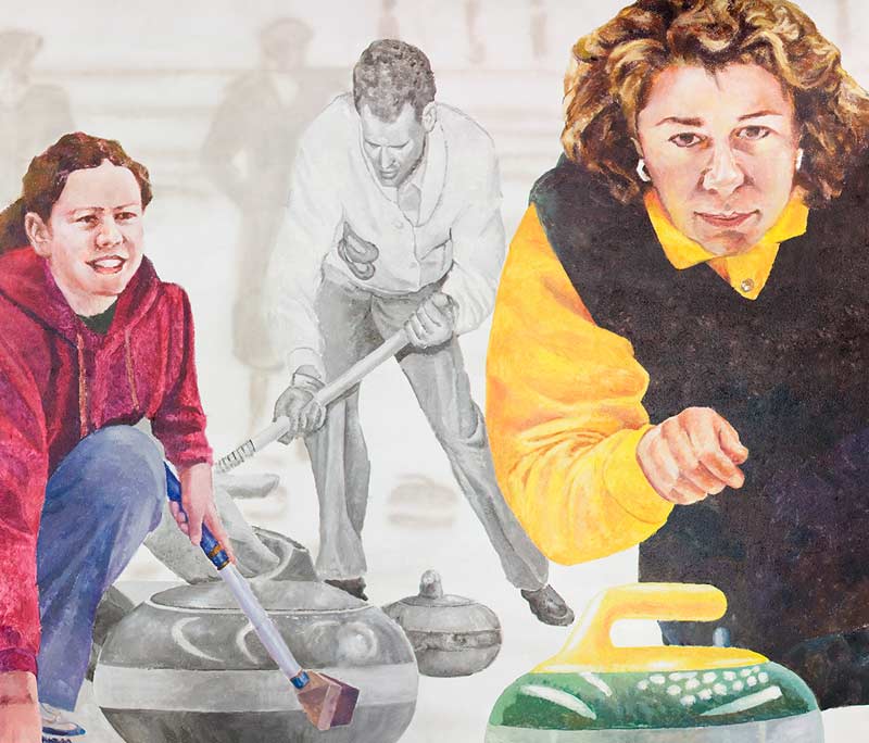
Millennium Place was building a new gym facility, but wanted to preserve the mural from the original gym. Repainting the mural was too costly and time-consuming, so we helped Millennium Place preserve it by taking high resolution photos of the mural in sections and reproducing it on concrete decals. We then installed it onto the walls of the new gym over the course of two days, ensuring visitors can enjoy both the new, larger facility and the mural for years to come.
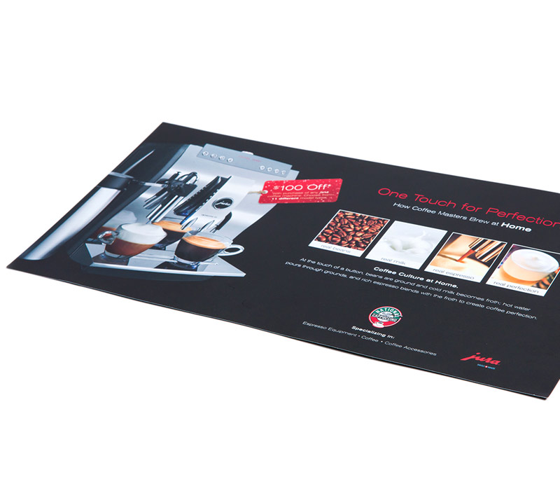
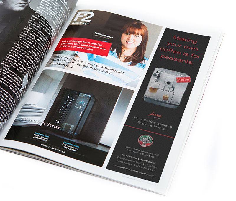
To reach customers on a more personal level, we promoted National Cappuccino in a print campaign, using targeted direct mail and publication advertisements. The print ads promoted specific products and services and reinforced brand recognition in local audiences.
We helped National Cappuccino get the word out about their Jura espresso machines by creating a set of print ads that promoted the product. The ads were modern, clean and featured eye-catching imagery along with persuasive, humorous copy.
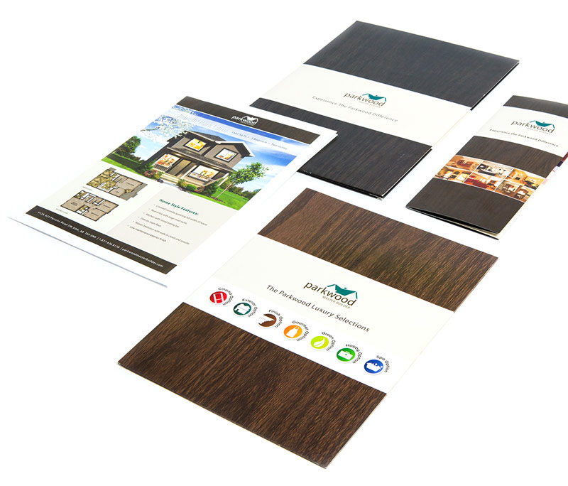
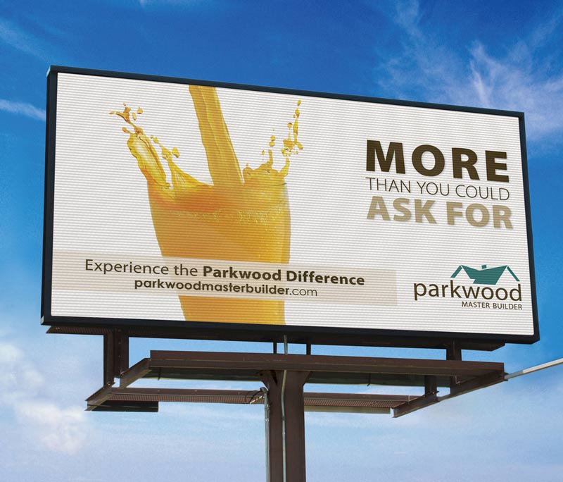
We were tasked with creating a brand style for Parkwood that matched their existing look and feel (including company imagery and taglines) while refreshing their identity. We created a modern, corporate, recognizable identity that Parkwood can use for years to come.
We delivered marketing campaigns for Parkwood to help promote waves of new homes they were building. We used fun, interesting taglines and images to capture the attention of target audiences. The result was fresh, clean and eye-catching ads.
We used large-format advertising for Parkwood to attract maximum exposure for relatively low cost. Our outdoor billboards were consistent with our other campaign materials and used bold, clean images and simple taglines to attract attention.
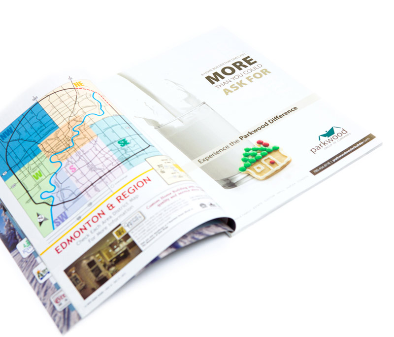
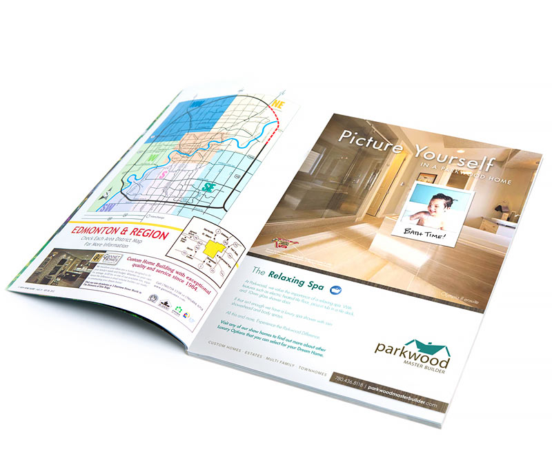
Our branded “Picture” campaign focused on Parkwood’s upgrade packages and showcased their high-quality home interiors. We used the “picture yourself in a Parkwood home” tagline and the polaroid photo overlay as a fun element to attract the audience’s attention and spur their imaginations.
Service Master was tasked with restoring six schools in the High River, Alberta area after a flood in summer 2013. They were asked to share their expertise at the 2014 Alberta Educational Facilities Administrators Association (AEFAA) Conference. We created an engaging, 90-minute presentation for them to use for this important appearance.
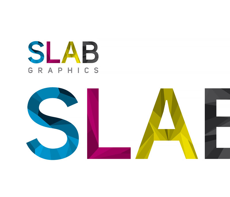
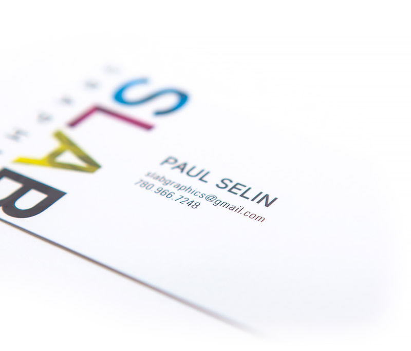
SLAB wanted a fun logo to communicate their expertise in the printing and graphic design industry. We created a strong visual concept that translated into to a colourful and bold look.
SLAB’s brand identity was minimal and clean to showcase their memorable logo. Our design features straightforward messaging and subtle colours to draw readers’ eyes to the call to action (SLAB’s contact information).
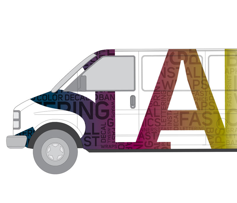
We created a large-format vehicle wrap for SLAB using the same bold style as the logo. The eye-catching, colourful design converted SLAB’s van into a mobile, memorable advertisement for the company.
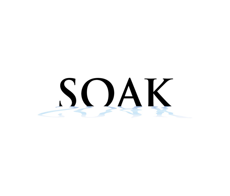
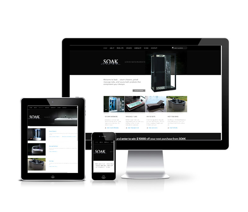
Any company’s logo must reflect their service or product, with iconic imagery to strengthen identity and brand. A logo should also be timeless...designed for longevity within the company’s industry or market. We created Soak’s distinctive logo following these principles.
A brand isn’t a colour or a font, it’s how your customers describe you to others. Since branding shapes your customers’ opinions and therefore your reputation, it must be consistent and memorable.
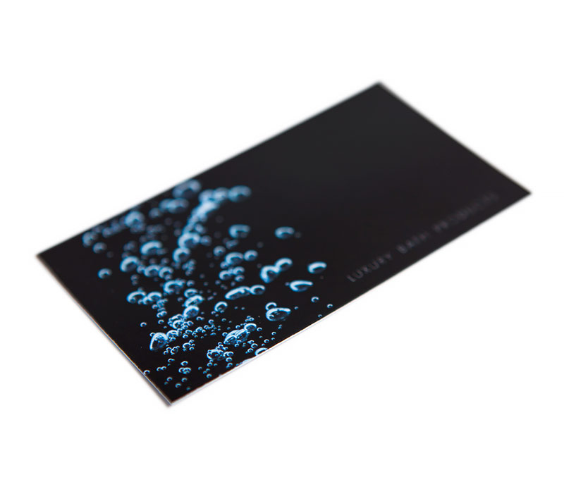
When designing different pieces for Soak, we knew that brand identity elements aren’t always restricted to letterhead and business cards, they can also encompass promotional items that help customers understand a company’s products or services. This helped us create persuasive, memorable items that reached Soak’s potential customers.
A website is an extension of a company’s brand and should contain consistent, persuasive imagery to encourage brand recognition. An intermediary touch point for a call to action, customers use a company’s website to make informed decisions. Soak’s website was also designed as an effective sales tool to showcase their products.
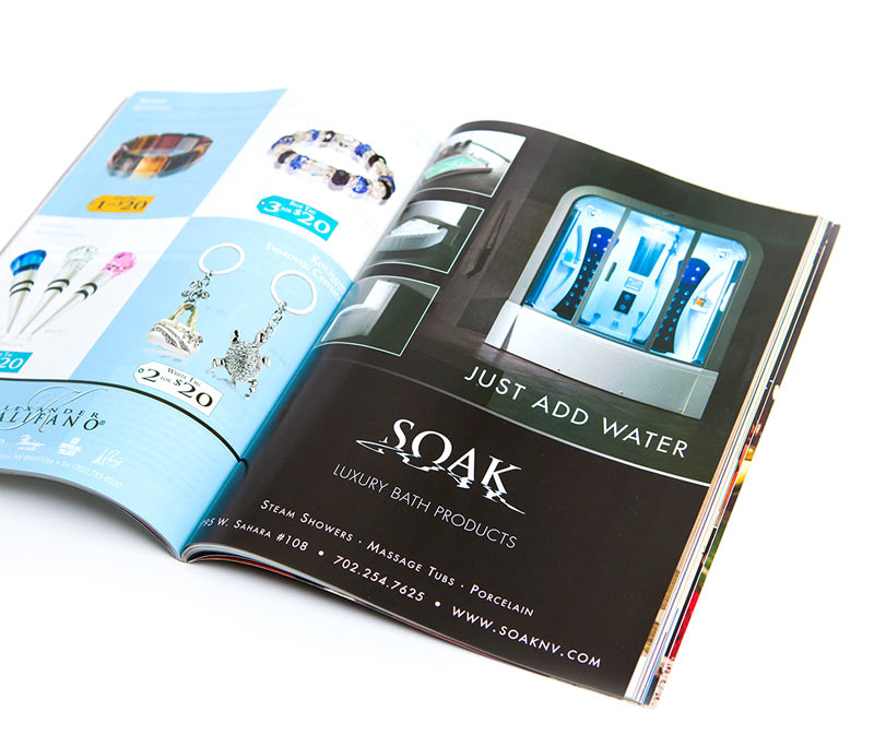
Advertising in publications and via direct mail reaches customers on a more intimate level because it allows companies to tap into a target market’s interests or reach out to them directly. When creating publication and direct mail for Soak, we placed ads in specific magazines to attract their target audience and made sure the ads showcased attractive products or current sales.
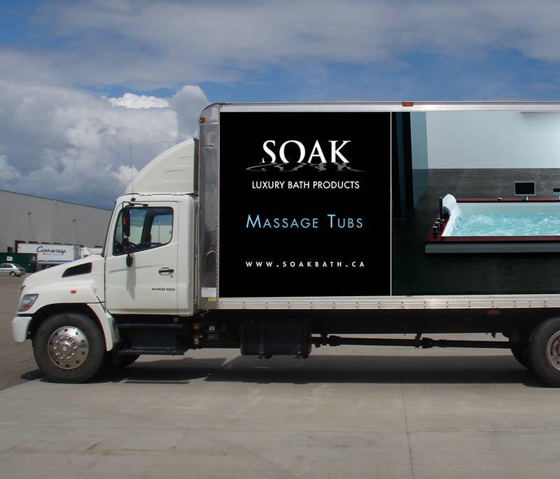
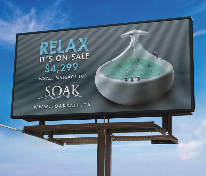
Large-format advertising reminds consumers of messages that are being promoted through other media. It’s important to stick to simple, direct messaging, using only a few words. Large-format pieces (such as store signage and outdoor billboards) give great value because they are relatively low-cost and offer a lot of exposure. We used large-format ads for Soak to further promote the company’s brand and their featured products and sales.
We created Soak’s “Relax, it’s on sale” campaign to promote featured products and sales, with brand-consistent messaging. We used a variety of mediums and a consistent look and feel to reinforce brand retention with customers.
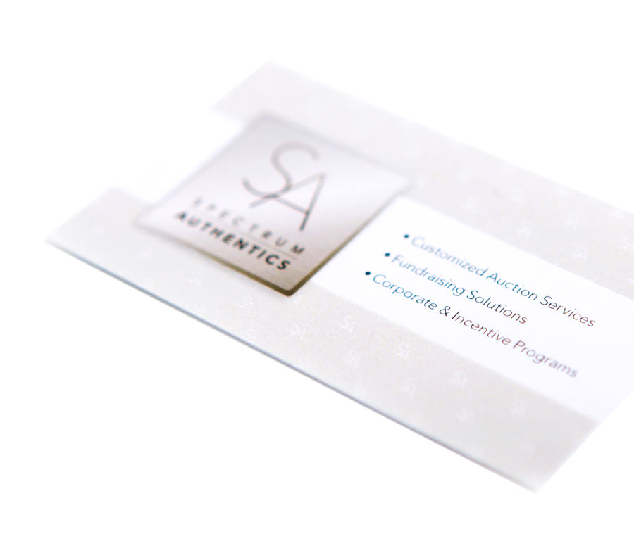
We created a brand identity so that all Spectrum Authentics marketing pieces give customers a consistent brand experience. The clean, modern look is flexible, consistent with the logo and will serve the company for years to come.
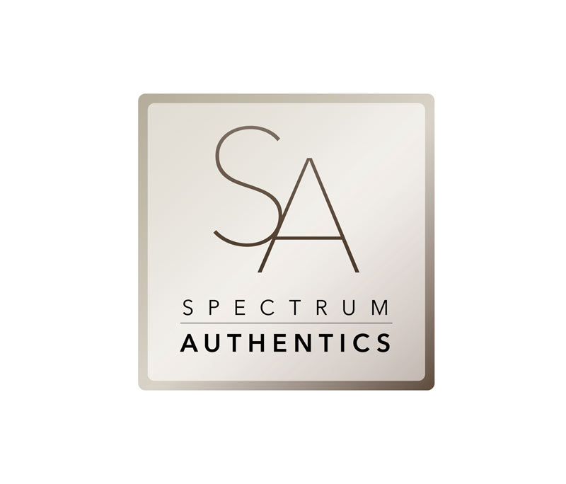
Logos can change over time, but brand equity remains, even through updates. Spectrum Authentics looked to PinPoint to help redesign their logo so that it was clean, modern and flexible across a variety of formats while retaining aspects of their existing brand.
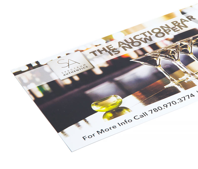
We created a print advertising campaign for Spectrum Authentics in order to create brand awareness with local audiences to ensure the company is top of mind for buyers who need products related to sports memorabilia. The eye-catching campaign was bold, clean and modern, reflecting Spectrum Authentic’s updated brand identity.
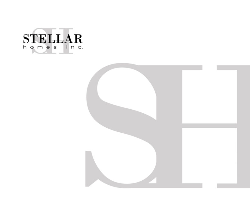
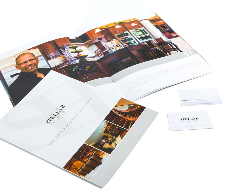
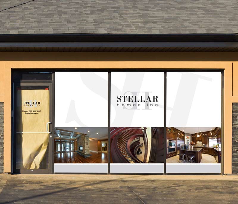
Stellar Homes needed a logo refresh to ensure that the brand impression they left customers was as high-quality as the homes they built. We reinvented their logo to provide a modern and sophisticated look.
To ensure Stellar’s brand identity gave customers a positive, memorable experience, we used consistent imagery, colour and typefaces. All the pieces in the Stellar identity package were designed to showcase the exceptional quality of the homes they built, encouraging brand retention.
We branded Stellar’s sales centre with consistent imagery and the logo to encourage brand awareness and reinforce messages we were promoting through other marketing channels. Since the sales centre was the final point of sale for customers to commit to building a custom home, it was essential that the brand experience was persuasive.
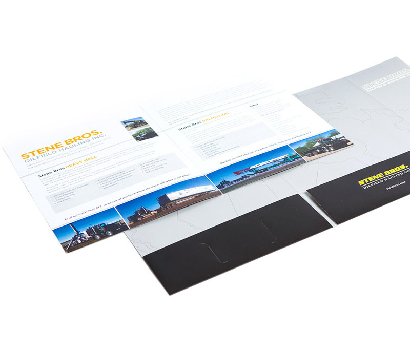
Stene Bros needed a standard set of marketing collateral to help them interact with clients. We provided them with a brochure and presentation folder and incorporated their existing company colours, yellow and black, into professional, clean designs.
A company’s logo must reflect their products or services. Recognizable, iconic imagery strengthens a company’s identity, promoting brand recognition, a key ingredient for customer retention. A logo should also be timeless to ensure it has longevity within a company’s industry or market. We redesigned Thompson Optics’ logo with all these elements in mind to produce a memorable identity that will serve them for years to come.
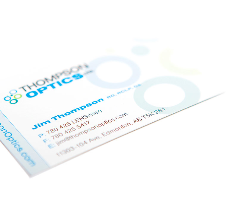
Customers’ opinions create a company’s reputation. Since branding shapes customers’ opinions, it’s essential that a brand is consistent and memorable. The Thompson Optics business cards were designed to create a lasting impression and reinforce Thompson’s commitment to high-quality service and care.
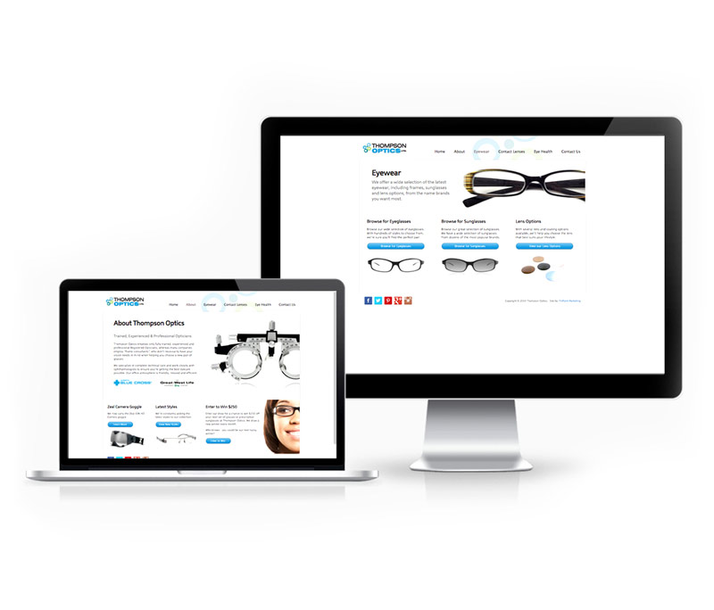
Since a website is an extension of a company’s brand, it’s essential that it leaves visitors with a positive experience. Designed as the intermediary touch point of a call to action, the Thompson Optics website allowed customers to make informed decisions about their eye care by providing details about their licensed opticians’ qualifications. The site also included hundreds of their most popular frame styles.
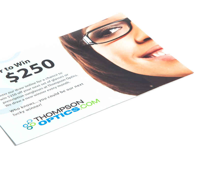
Direct mail pieces are an effective way to make a personal connection with customers and reach a large, geographically-targeted audience. Our mailers for Thompson Optics promoted their services while increasing brand awareness.
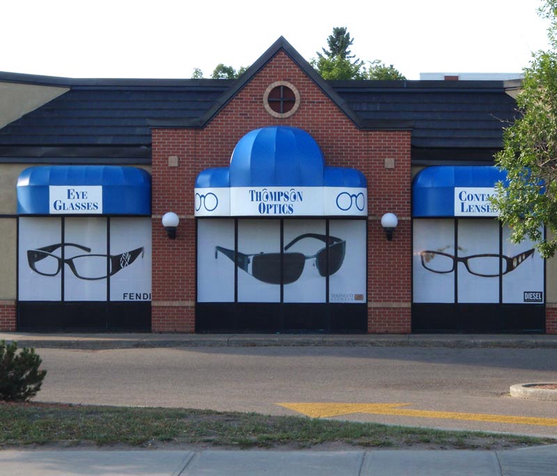
Large-format advertising reminds consumers of messages that are being promoted through other media. It’s important to stick to simple, direct messaging, using only a few words. Large-format pieces (such as storefront signage) give great value because they are relatively low-cost and offer a lot of exposure. Thompson Optics’ large-format signage promoted the company’s brand and their featured products and sales.
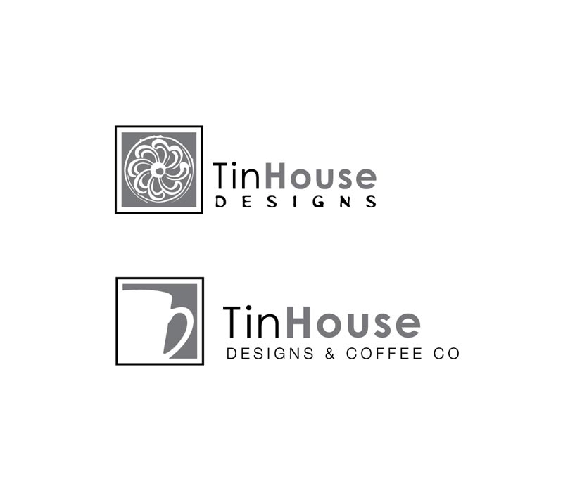
TinHouse’s two divisions (TinHouse Designs and TinHouse Designs & Coffee Co) needed a unified brand identity. We created two complementary logos with a cohesive look and feel.
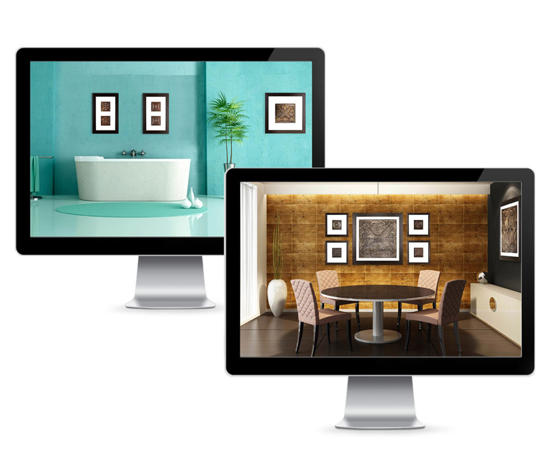
For an artist, branding must be representative of their style. Identity pieces are used as self-promotion, so a positive brand experience is crucial. We developed a digital presentation to showcase TinHouse Design’s artwork that was displayed on a plasma screen in the gallery to create a welcoming, cohesive brand experience for customers.
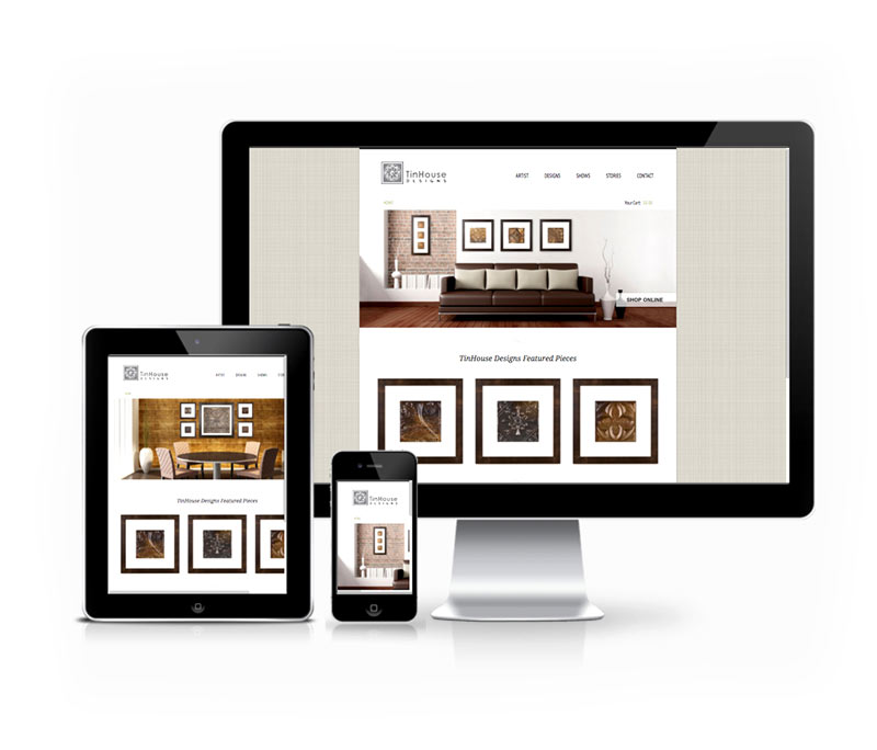
Artists’ websites are an extension of their personal style and brand and must make an immediate visual impact. We created TinHouse Designs’ website as a showcase for the artwork, with an online portfolio and e-commerce capabilities, making it easy for buyers to view and purchase artwork.
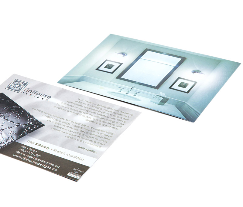
Direct mail and flyers are an effective way to reach potential customers on a more personal level. We designed postcards for the TinHouse coffee shop and art shows that also doubled as direct mail pieces. The self-promotion card showcased the artist’s best work through large, eye-catching visuals.
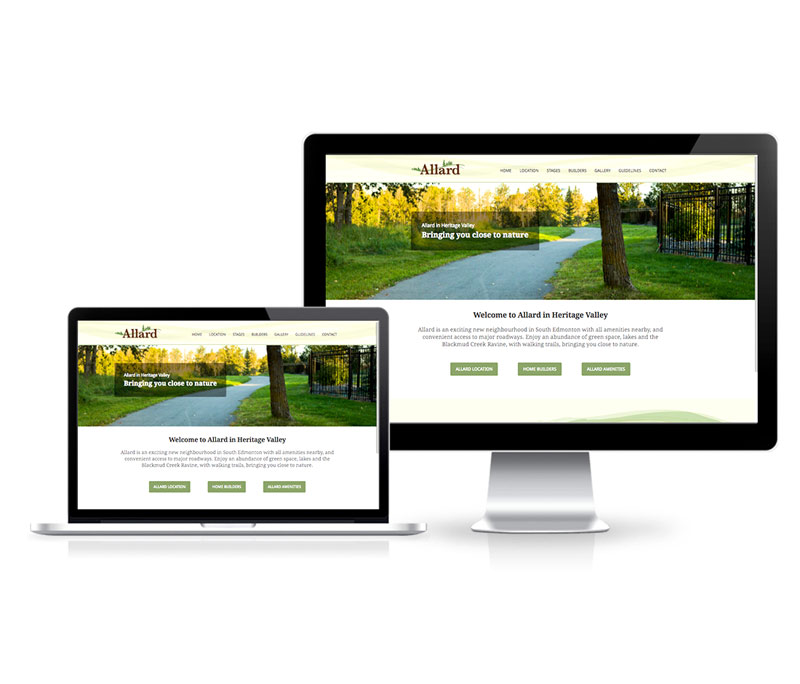
To help United Communities reach customers interested in buying units in Allard in Heritage Valley, we created a website showcasing the neighbourhood in south Edmonton and its proximity to major roads, recreational space, lakes and other amenities.
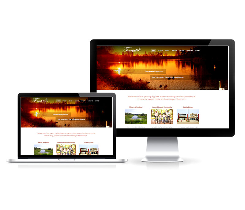
Trumpeter by Big Lake, a residential community located on the northwest edge of Edmonton, featured 300 acres of rolling hills, woodlands and natural wetlands. We helped United Communities connect with prospective buyers by creating a website that showcased the natural beauty of the development and the lifestyle homeowners could enjoy.
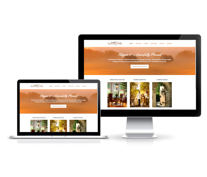
Tuscany Hills in Sturgeon County, Alberta, combined estate living with country charm. We helped United Communities promote this exclusive, architecturally-controlled community to interested buyers by creating a clean, accessible website that showed customers the lotoptions and nearby amenities.
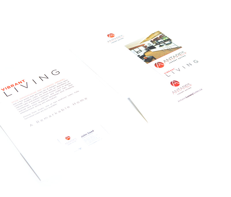
We created an iconic logo for Antares, a luxury rental building located in downtown Winnipeg, inspired by the building’s surrounding urban environment. Memorable and versatile, the logo’s style is clean and modern, with eye-catching colours.
The brand identity for Antares focused on expanding on the logo design and using white space to create contrast with the vibrant brand colours. We used a circular pattern throughout the identity to tie the design and logo together while using minimal, clean design to reflect the luxury esthetic of the building.
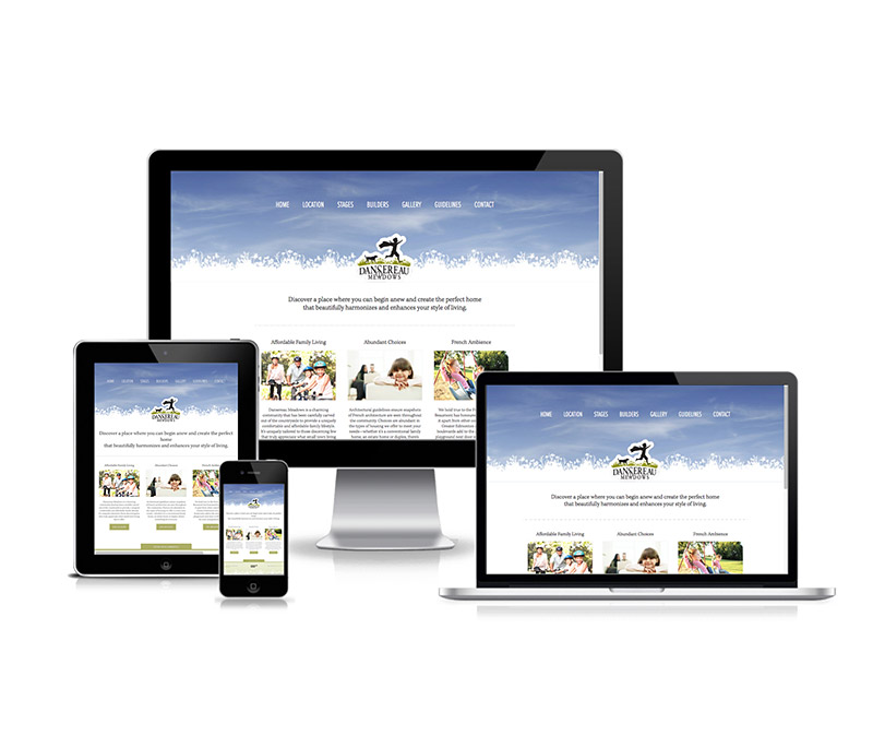
Dansereau Meadows is a charming community that has been carefully carved out of the countryside to provide a uniquely comfortable and affordable family lifestyle. We helped Anthem United promote this community to interested buyers by creating a clean, accessible website that showed customers the lot options and nearby amenities.